The Making of a Logo: A Study in Collaboration
 The Somaiya Kala Vidya logo was officially launched with the exhibition of Bhujodi to Bagalkot. Creating this identity was a study in collaboration.
I have long been fascinated by collaboration. When there are two authors on a work, how did it actually happen? Did one write the first half and the other the second? Did one talk and the other write? There are probably as many methods as there are collaborations. Here is how our logo evolved:
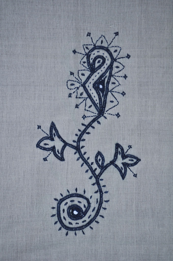
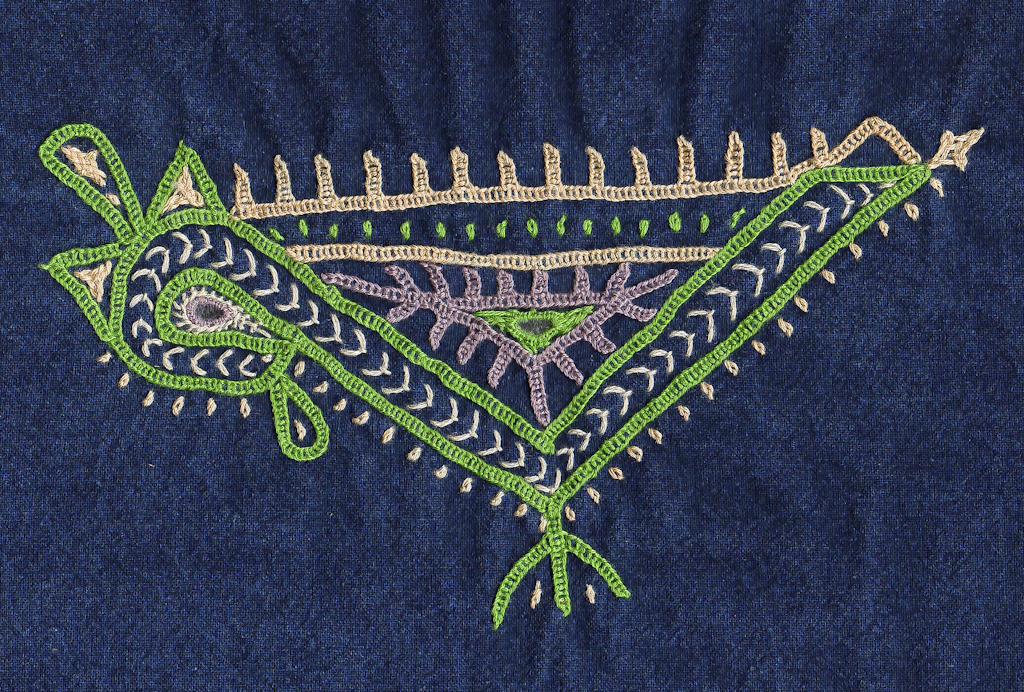
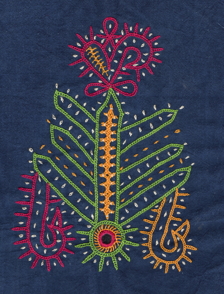
I had a concept. I wanted to show tradition coming alive, a motif that one could recognize as traditional, and yet it was new- what we teach at Somaiya Kala Vidya. I thought of inviting women to embroider their examples, as a contest. So I gave book cover sized fabric and threads to many women in many villages. They made many motifs, but none quite expressed what I hoped to see. I liked Sajnuben’s parrot the best. It had character. But it was still. So I thought of my friend Nina Sabnani, animator par excellence. I knew that if anyone could breathe life into this parrot, she could. I flapped my arms, trying to convey the sense of joy in flight I was imagining.
Nina and Piyush made many renditions of Sajnuben’s parrot. Many, many. We got tired then, and took a break while Dayabhai and I went to the USA.
On return, we came straight from the airport to Nina’s house, crashed, and in the morning all looked at the logo again. Piyush revived the parrot. Nina gave it a final tickle. It was flying!

But what about colour? Dayabhai asked. We narrowed it down to parrot green…. And pink. Dayabhai was not satisfied. He turned the colour wheel a bit… until it was a darker green with maroon. Much more dignified for an institution.

Nina added the title, in Optima, one of her favorite fonts. We pushed it back and forth, up and down, til we were happy.
Nina studied it. It still needed something to complete it, something to make it sing. She tried another, tiny parrot. Too complicated. Then, inspiration struck: She took the mirror from Jivaben’s motif, and placed it above the title.
Bingo. The logo was born.


